Critical Engagement with the Art of Typography in Web Design
The digital landscape is constantly evolving, and with it, the ways in which we interact with online content. Among the myriad of design elements that constitute a web page, typography remains a central pillar of user experience. A well-chosen font does more than simply ferry words; it conveys mood, emphasizes importance, and sets the tone for the reader’s journey through the digital space. In the forthcoming discussion, we delve into the transformative power of thoughtful typography on your site’s user experience. We aim to illuminate how the deliberate selection of typefaces, combined with fines and nuance in sizing, spacing, and layout, can not only captivate your audience but also facilitate readability and accessibility. Our exploration will provide readers with practical tips to elevate their website’s typographic presentation, ultimately enhancing user engagement and content absorption.
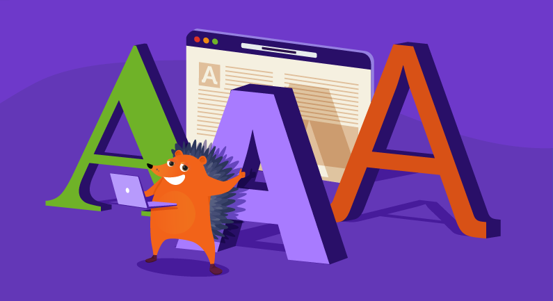
The Essence of Typography in User Experience
Before plunging into practical advice, it is essential to understand the fundamental role that typography plays in user experience. Typography speaks in silent voices to your users, often dictating the effectiveness of content before a single line is read. It is not merely about the style of the letters and words but about orchestrating them into an easy-to-navigate, visually pleasing narrative.
Facets of Typography: More Than Just Fonts
To fully grasp the potential of typography, one must consider its multifaceted nature. Typography encompasses a range of elements, from font choice and size to line length and letter spacing. Each of these components harmonizes to create a comfortable and engaging reading environment, which is crucial for holding a user’s attention in an era marked by information overload.
Typography’s Influence on Accessibility and Readability
The conversation about typography extends to its significant impact on accessibility and readability. In an age where inclusivity cannot be overstated, the choice of typeface and text layout can define content’s legibility for individuals with visual impairments or reading disabilities. A website’s typographical choices should not only charm but also embrace the broad spectrum of its users.
Practical Tips for Enhancing Your Website with Typography
Bearing in mind the critical relationship between typography and user experience, how does one proceed to harness its power? The following segment offers actionable tips that encapsulate best practices in typographic design tailored to improve your site’s user interface and to ensure that the medium does justice to the message it presents.
- Understanding and implementing the right font combinations to reinforce your brand identity.
- Employing the appropriate font sizes and hierarchies to guide users through your content effortlessly.
- Optimizing line spacing and line length to enhance reading comfort across different devices.
- Utilizing whitespace strategically to create focus points and reduce cognitive load.
- Ensuring high contrast between text and background to support readability under various conditions.
- Embracing responsive typography to provide a seamless reading experience regardless of the platform used.
With these tips in mind and a detailed exploration of each to follow, we invite you on a journey to transform your site’s user experience through the astute application of typographic design.
