Want to share your content on R-bloggers? click here if you have a blog, or here if you don’t.
If you like these contributions, please consider buying me a coffee.
About
I added the CP 1919 / PSR B1919+21 Dataset to my GitHub.
This dataset, found in one of my old external drives, corresponds to the famous plot from Radio Observations of the Pulse Profiles and Dispersion Measures of Twelve Pulsars (Craft, 1970). This is broadly known as the Joy Division’s plot from Unknown Pleasures. If you happen to know whom created the provided CSV file, please let me know so I can give proper credit.
The dataset contains “successive pulses from the first pulsar discovered, CP 1919, are here superimposed vertically. The pulses occur every 1.337 seconds. They are caused by rapidly spinning neutron star.” (The Cambridge Encyclopaedia of Astronomy, 1977)
Thanks to Scientific American, there is a complete explanation of the dataset and its origin.
Read
pulsar <- readr::read_csv("https://raw.githubusercontent.com/pachadotdev/cp1919/main/cp1919.csv")
Rows: 24000 Columns: 3
── Column specification ────────────────────────────────────────────────────────
Delimiter: ","
dbl (3): x, y, z

ℹ Use `spec()` to retrieve the full column specification for this data.
ℹ Specify the column types or set `show_col_types = FALSE` to quiet this message.
pulsar
# A tibble: 24,000 × 3
       x     y     z
   <dbl> <dbl> <dbl>
 1     1     1 -0.81
 2     2     1 -0.91
 3     3     1 -1.09
 4     4     1 -1
 5     5     1 -0.59
 6     6     1 -0.82
 7     7     1 -0.43
 8     8     1 -0.68
 9     9     1 -0.71
10    10     1 -0.27
# ℹ 23,990 more rows
Visualize
The Cambridge Encyclopaedia of Astronomy (1977)
library(ggplot2)
library(ggridges)

col1 <- "white"
col2 <- "black"

ggplot(pulsar, aes(x = x, y = y, height = z, group = y)) +
  geom_ridgeline(
    min_height = min(pulsar$z),
    scale = 0.2,
    linewidth = 0.5,
    fill = col1,
    colour = col2
  ) +
  scale_y_reverse() +
  theme_void() +
  theme(
    panel.background = element_rect(fill = col1),
    plot.background = element_rect(fill = col1, color = col1),
  )

The Nature of Pulsars (Scientific American, 1970)
col1 <- "#94cee1"
col2 <- "white"

ggplot(pulsar, aes(x = x, y = y, height = z, group = y)) +
  geom_ridgeline(
    min_height = min(pulsar$z),
    scale = 0.2,
    linewidth = 0.5,
    fill = col1,
    colour = col2
  ) +
  scale_y_reverse() +
  theme_void() +
  theme(
    panel.background = element_rect(fill = col1),
    plot.background = element_rect(fill = col1, color = col1),
  )

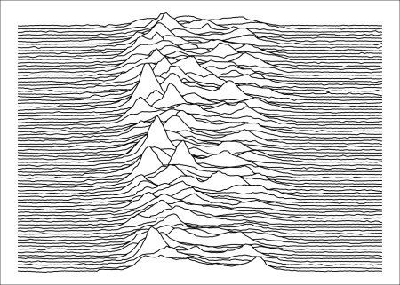
Joy Division’s Unknown Pleasures (1979)
col1 <- "black"
col2 <- "white"

ggplot(pulsar, aes(x = x, y = y, height = z, group = y)) +
  geom_ridgeline(
    min_height = min(pulsar$z),
    scale = 0.2,
    linewidth = 0.5,
    fill = col1,
    colour = col2
  ) +
  scale_y_reverse() +
  theme_void() +
  theme(
    panel.background = element_rect(fill = col1),
    plot.background = element_rect(fill = col1, color = col1),
  )

R-bloggers.com offers daily e-mail updates about R news and tutorials about learning R and many other topics. Click here if you’re looking to post or find an R/data-science job.
Want to share your content on R-bloggers? click here if you have a blog, or here if you don’t.
Continue reading: CP 1919 / PSR B1919+21 Dataset
Insights and Future Implications of the CP 1919 / PSR B1919+21 Dataset
The author of the input text has contributed to the open-source community by adding the CP 1919 / PSR B1919+21 Dataset to their GitHub repository. This dataset is derived from the first pulsar ever discovered, CP 1919, and includes data on the pulsar’s successive pulses. Each pulse occurs roughly every 1.337 seconds, the result of the rapid spinning of the neutron star.
Value of Open-Source Data Visualizations
Three unique data visualizations using the ‘ggplot2’ and ‘ggridges’ libraries are showcased in the input text, each presenting the dataset in different color schemes. These visualizations not only help to explain the data but they also make the data accessible and understandable to a broader audience. This has significant long-term implications for data accessibility and opens up opportunities for more individuals and organizations to leverage this dataset and extract valuable insights.
Actionable Advice
1. Collaborate to Improve Data Attribution: The author found this dataset in one of their old external drives and it is not known who initially gathered the dataset into a CSV file. It could be beneficial for the open-source data community to collaborate on improving metadata and data lineage transparency, ensuring data creators and contributors are properly credited.
2. Advocate for Data Accessibility: Our understanding of universal phenomena can come from the most unexpected places – in this case, a pulsar discovered back in 1919. Advocates in the field should work on making more such datasets available, as they can play a pivotal role in enabling more discoveries.
3. Learn and Leverage R Programming: For those interested in data analysis, visualization, and science, it is advisable to learn how to interact with data using R programming language. The visuals generated with ‘ggplot2’ and ‘ggridges’ in this input testify to the power and flexibility that R can provide for visualizing complex data.
4. Explore Data Reuse for New Insights: The original intent behind creating a dataset may limit its use in that original context. But freely available datasets, like CP 1919 / PSR B1919+21, can be reused for a variety of other purposes. Creatives, data scientists, and researchers can repurpose such data providing fresh insights or contributing to the development of interdisciplinary applications.