In recent years, there has been an increasing demand for customizable 3D virtual spaces. Due to the significant human effort required to create these virtual spaces, there is a need for efficiency…
In a rapidly evolving digital landscape, the demand for customizable 3D virtual spaces has surged in recent years. However, the intricate process of creating these virtual environments often poses a significant challenge, requiring substantial human effort and time. As a result, the quest for efficiency in designing and constructing these spaces has become paramount. In this article, we delve into the innovative technologies and approaches that are revolutionizing the creation of customizable 3D virtual spaces, paving the way for a more seamless and efficient virtual experience. From automated design tools to advanced algorithms, we explore the cutting-edge solutions that are reshaping the landscape of virtual space creation, offering a glimpse into the future of immersive digital environments.
The Rise of Customizable 3D Virtual Spaces: The Need for Efficiency and Innovation
In recent years, the demand for customizable 3D virtual spaces has soared to new heights. These immersive environments have become a vital tool for various industries, including gaming, architecture, education, and entertainment. However, creating these virtual spaces is no small feat. It requires significant human effort, making efficiency a critical factor in meeting the growing demand.
The Challenge of Creating 3D Virtual Spaces
Crafting a 3D virtual space requires meticulous attention to detail, from modeling and texturing to lighting and animation. Traditionally, this process is labor-intensive and time-consuming, limiting the number of virtual spaces that can be developed and customized.
The primary hurdle lies in the manual creation of assets. Every object, surface, and texture must be individually crafted and manipulated by skilled artists and designers. As virtual spaces become more complex and diverse, this time-consuming process diminishes efficiency and scalability.
The Need for Efficiency and Innovation
To bridge the gap between the increasing demand for customizable 3D virtual spaces and the limitations of human effort, innovation is essential. Streamlining the creation process and exploring new approaches can revolutionize the industry, enabling faster production and greater customization possibilities.
One innovative solution lies in the incorporation of artificial intelligence (AI) and procedural generation techniques. By leveraging AI algorithms, developers can automate certain aspects of asset creation. This technology can analyze existing virtual spaces, learn patterns, and generate new assets based on user requirements. This approach significantly reduces the manual labor involved in asset creation, empowering designers to focus on more complex and creative tasks.
Procedural generation further enhances efficiency by dynamically generating elements of a virtual space based on predefined rules and algorithms. This technique allows for the rapid creation of diverse and unique content, minimizing the need for handcrafted assets.
Expanding the Boundaries with Cloud-Based Collaboration
Another groundbreaking approach is cloud-based collaboration. By leveraging cloud technologies, designers worldwide can work together on 3D virtual space projects in real-time, regardless of their location. This approach breaks down geographical barriers, fosters international collaboration, and accelerates the development process.
Cloud-based collaboration not only promotes efficiency but also creates new opportunities for innovation. Designers can collectively brainstorm ideas, share their expertise, and build upon each other’s work. This collaborative environment fuels creativity and encourages the exploration of new concepts, pushing the boundaries of customizable 3D virtual spaces.
The Future of Customizable 3D Virtual Spaces
As the demand for customizable 3D virtual spaces continues to grow, innovation remains a driving force in meeting this demand efficiently. The integration of AI and procedural generation techniques, along with cloud-based collaboration, offer groundbreaking solutions to streamline the creation process and enhance customization possibilities.
With increased efficiency, flexibility, and collaboration, the possibilities for customization are limitless. From personalized gaming experiences to immersive architectural visualizations, customizable 3D virtual spaces are set to reshape various industries and create new frontiers of virtual exploration. As technology advances and new paradigms emerge, we can only anticipate what exciting developments lie ahead for customizable 3D virtual spaces.
and automation in the process. This has led to the emergence of artificial intelligence (AI) and machine learning (ML) technologies that can assist in the creation and customization of 3D virtual spaces.
One of the most promising applications of AI and ML in this domain is the generation of realistic and immersive environments. Traditionally, creating 3D virtual spaces involved manually modeling each object, texture, and lighting, which was a time-consuming and labor-intensive task. However, with the advancements in AI and ML algorithms, it is now possible to generate 3D environments automatically.
These algorithms use deep learning techniques to analyze large datasets of existing 3D virtual spaces and learn the patterns and structures within them. By doing so, they can generate new environments that are both visually appealing and coherent. This automation not only saves time and effort but also allows for greater customization options, as users can specify their preferences and let the AI algorithms generate the desired virtual space accordingly.
Furthermore, AI and ML can also assist in the customization of virtual spaces based on user input and preferences. By analyzing user data, such as past interactions, browsing history, and demographic information, AI algorithms can personalize the virtual space to suit individual needs. For example, an AI system can learn a user’s preferred color schemes, furniture styles, and layout preferences, and automatically apply them to the virtual space.
Looking ahead, we can expect further advancements in AI and ML technologies to revolutionize the creation and customization of 3D virtual spaces. One potential development is the integration of AI-powered virtual assistants, which can interact with users in real-time and provide suggestions and recommendations for customizing their virtual spaces. These virtual assistants could utilize natural language processing and computer vision techniques to understand user preferences and provide personalized recommendations.
Additionally, the combination of AI and augmented reality (AR) holds great potential for enhancing the customization of 3D virtual spaces. AR technologies can overlay virtual objects onto the real world, allowing users to see and interact with them in their physical surroundings. By integrating AI algorithms, users could have the ability to customize the appearance and behavior of these virtual objects, making their virtual spaces even more personalized and interactive.
In conclusion, the demand for customizable 3D virtual spaces is driving the need for efficiency and automation in their creation. AI and ML technologies are playing a crucial role in streamlining the process and enabling greater customization options. As these technologies continue to advance, we can expect more automated generation and personalized customization of 3D virtual spaces, ultimately leading to more immersive and tailored virtual experiences for users. Read the original article
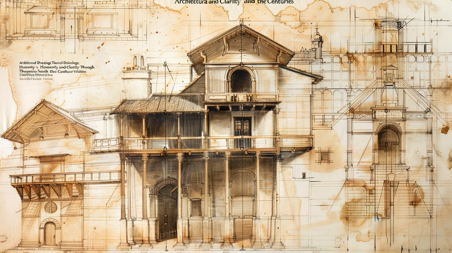
Title: The Future of Architectural Drawings: Embracing Technology and Collaboration
Introduction:
In the May 2024 issue of Apollo, we delve into the intriguing world of architectural drawings and the potential future trends associated with this age-old practice. Taking inspiration from Leon Battista Alberti’s emphasis on clear communication, we explore how technology and collaboration are reshaping architectural drawings. This article will provide a comprehensive analysis of key points and offer unique predictions and recommendations for the architectural industry.
Key Points:
1. Technological Advancements in Architectural Drawings:
The advent of digital tools such as Computer-Aided Design (CAD) software has revolutionized architectural drawings. With 3D modeling capabilities becoming increasingly advanced, architects can now create highly realistic representations of their designs. The integration of Virtual Reality (VR) and Augmented Reality (AR) technologies further immerses clients and stakeholders in the design process, enabling them to visualize projects in unparalleled detail.
2. Collaborative Design Processes:
Collaboration is becoming a fundamental aspect of architectural design. Teams are now using cloud-based platforms and project management tools to facilitate seamless communication and teamwork. These platforms allow architects, engineers, and clients to collaborate in real-time, regardless of their physical location. This approach allows for quicker decision-making, improved coordination, and increased efficiency throughout the project lifecycle.
3. Sustainable Design Integration:
The industry is witnessing a growing emphasis on sustainable architecture, and architectural drawings play a crucial role in this movement. Future trends suggest tighter integration of sustainable design principles within the concept, schematic, and construction documentation phases. The use of energy modeling tools, daylight analysis, and material optimization software will enable architects to create eco-friendly buildings while maximizing energy efficiency and reducing carbon footprints.
4. Digitization of Building Information Modeling (BIM):
Building Information Modeling (BIM) has gained widespread popularity in recent years. In the future, BIM will be further enhanced through the digitization of architectural drawings. This will enable seamless data exchange and integration with other disciplines such as structural engineering, mechanical systems, and construction management. As a result, project stakeholders will have access to accurate and up-to-date information throughout the building’s lifecycle, enhancing communication and reducing errors.
5. The Role of Artificial Intelligence (AI):
Artificial Intelligence (AI) is expected to play an influential role in the future of architectural drawings. AI algorithms can analyze vast amounts of data, optimize design solutions, and identify potential flaws within architectural and engineering designs. This technology can assist architects in generating innovative designs while adhering to strict regulations and safety standards. By leveraging AI, architects will have greater freedom to explore new possibilities and push the boundaries of architectural creativity.
Predictions and Recommendations:
1. Embrace and Invest in Advanced Digital Tools:
Architectural firms should invest in state-of-the-art software and technology to remain competitive in the evolving industry. Incorporating CAD, VR, AR, and BIM software into their workflows will allow architects to deliver compelling visualizations and improve collaboration throughout the design process.
2. Foster Cross-Disciplinary Collaboration:
Architects must embrace collaboration within and outside their domains. Collaborative platforms and tools facilitate efficient communication and seamless information exchange, enhancing overall project outcomes. By actively engaging with engineers, sustainability experts, and other professionals, architects can develop more holistic and sustainable designs.
3. Prioritize Sustainable Design:
As society becomes increasingly concerned about climate change, architects should integrate sustainable design principles into their projects. By leveraging energy modeling and material optimization software, architects can create environmentally conscious buildings that align with regulatory standards and exceed client expectations.
4. Embrace AI as a Design Assistant:
Architects should view AI as an invaluable tool rather than a replacement for their creative expertise. By using AI algorithms to analyze data and generate optimized design solutions, architects can streamline their workflows, improve efficiency, and deliver innovative designs that surpass client expectations.
Conclusion:
The future of architectural drawings is promising, driven by technological advancements, collaborative processes, sustainability, and AI integration. By embracing these trends and implementing our recommendations, architects can navigate a transformative landscape that empowers them to create awe-inspiring designs while meeting the needs of an ever-changing world.
References:
1. AIA Architect: “Technology and Collaboration: The Future of Architectural Drawings”
(https://www.aia.org/resources/6381739-technology-and-collaboration-the-future-o)
2. ArchDaily: “The Future of Architectural Visualization and Immersive Storytelling”
(https://www.archdaily.com/972848/the-future-of-architectural-visualization-and-immersive-storytelling)
3. Autodesk: “BIM and the Future of Architectural Design”
(https://www.autodesk.com/solutions/bim-hub/future-architecture)
4. ArchDaily: “The Role of Artificial Intelligence in Design”
(https://www.archdaily.com/937215/the-role-of-artificial-intelligence-in-design)
5. World Green Building Council: “Net Zero Carbon Buildings: The Case for Action”
(https://www.worldgbc.org/advancing-net-zero/net-zero-carbon-buildings-case-action)
Unravel the Future: Dive Deep into the World of Data Science Today! Data Science Tutorials.
How to add Axes to Plot in R, In the world of data visualization, creating visually appealing and informative plots is crucial for effectively communicating insights.
The R programming language offers a plethora of tools to customize your plots, including the ability to add user-defined axis ticks using the axis() function.
In this article, we will walk you through three examples that demonstrate how to create plots with custom axis ticks in R.
The c() function is used to define the tick values for the respective axis:
axis(side = 1, # Draw x-axis
c(0, 50, 100, 150, 200)) #Just an example
axis(side = 2, # Draw y-axis
c(10, 50, 150)) #Just an example
Example 3: Plot with Axis Mark on Top & Right Side
In some cases, you may want to add axis ticks on the top and right side of the plot.
This can be achieved using the same R code as in the previous example, but with different values for the side parameter.
Instead of 1 and 2, we will use 3 and 4 to represent the top and right axes, respectively:
plot(1:200,           # Plot without axes
     xaxt = "n",
     yaxt = "n")
axis(side = 3, # Add axis on top
c(0, 50, 100, 200)) #Just an example
axis(side = 4, # Add axis on right side
c(0, 50, 110)) #Just an example
Deep Dive into Customized Plot Axes in R: Long-term Implications and Future Trends
The R programming language, widely used in data science, is renowned for its robust capabilities in data visualization. A critical facet of generating well-illustrated graphics lies in customizing axes, as lucidly demonstrated in a recent tutorial. By exploring different techniques of constructing custom axis labels in R, you can create more precise and appealing data visualizations.
Why Tailoring Axes in R Plots Matters
R provides the opportunity to add user-defined axis ticks using the axis() function. The advantage of this is twofold: it enhances the readability of your plots and empowers you to communicate your data insights more effectively. This capacity also anticipates more complex visualization needs arising in the future, as data become more complex and intricate.
Examples Discussed
A basic plot with default axis ticks
Plot with user-specified axis ticks
Plot with axis marks on the top and the right side
What Does the Future Hold?
As our data continue to grow more nuanced and detailed, a ‘one-size-fits-all’ approach to visualization will quickly prove sub-optimal. This trend suggests that custom solutions, such as personalized axis ticks in R, will increasingly be in demand. Visualization tools and techniques that offer more granularity and adjustability, such as the axis() function in R, are likely to gain further popularity.
Actionable Advice
If you are a data scientist or a data-driven professional, mastering advanced data visualizations is a concrete, actionable step you can take to stay ahead in your field.
Practice: Ensure a sound understanding of these techniques by trying them on your datasets. Practice is, after all, instrumental in mastering any new concept or tool.
Share: Share your plots with others. Feedback from peers can provide new insights and identify any areas for improvement.
Stay Updated: Maintain an overview of the trends and emerging capabilities in data visualization. This will help you diversify your toolset and deliver compelling visuals.
In conclusion, the axis() function in R offers a powerful tool for creating customized, more informative plots. As the data we work with continues to grow, mastering such tools is central to effectively communicate our insights.
Want to share your content on R-bloggers? click here if you have a blog, or here if you don’t.
You have the fundamentals of R Highcharts under your belt by now. The next logical step is to introduce a bit more complexity in the code, but for the greater good. And that good is implementing drilldown charts straight in R! This will allow you to click on individual chart elements to open up yet another visualization that displays the data for a selected segment. Think sales for a country (overall) vs sales for a city (drilled down).
And sure, working with R Highcharts drilldown involves more code, as you have to prepare two datasets and link them, but the overall benefits outweigh the costs. You’ll see why in a bit. But first, let’s answer the question – What’s wrong with plain visualizations in the first place?
What’s the Problem with Plain Highcharts Visualizations?
Unlike many R packages, Highcharts (through highcharter) is animated and interactive out of the box. There’s nothing wrong with it, and you’re likely to get better-looking results than with almost any other alternative.
That doesn’t mean you can’t take the whole thing a step further. The “problem” is – when users see interactive elements, they want to click on them. It’s an issue because nothing happens on click by default. This section will demonstrate it.
To start, install the following R packages if you don’t have them already:
We’ll use a custom dataset for this article, so let’s go over it next.
Our Dataset
Opting for a custom dataset means we’ll spend the least amount of time possible cleaning and aggregating data, which is great, because we want to focus on visualization.
Copy the following snippet into a data.csv file – it contains a made-up total sales for cities in three countries:
In R, you can load this dataset with the read.csv() function:
sales <- read.csv("data.csv")
sales
Image 1 – Made-up sales dataset
Dataset covered! Let’s visualize it with R Highcharts to see what’s wrong.
The Problem: Users Want to Click on Interactive Elements
Assume you want to see the total amount of sales per country and per city. Easy enough, but it will require two charts. Let’s cover country-level first.
You can use the dplyr package to group the data by country and sum the sales:
hchart(sales_spain, "column", hcaes(x = city, y = sales), color = "#0198f9") |>
  hc_title(text = "Sales in Spain by city")
Image 5 – Sales by city in Spain plot
These two charts should be connected somehow. You should be able to click on a column for a given country to see drilled-down sales distribution per city. You should also be able to go back from the second visualization to the first.
R Highcharts drilldown visualizations are the way to go!
Your First R Highcharts Drilldown Visualization
As mentioned earlier, drilldown charts are nothing but a connected set of two charts. For you, this means you’ll have to prepare two datasets – one responsible for each chart. Preparing the second one is a bit tricky, but we’ll cross that bridge when we get to it.
The dataset for the first chart is nothing you haven’t seen before – a summation of sales on a country basis:
This is where things get interesting. We’ll now use a new group_nest() function to group the sales data by country column and nest the data within each group. You’ll end up with a list-like column in the end.
Then, we apply the map() function to iterate over each nested data frame, and use mutate() to add two new columns.
The final call to map() is used to convert the data frame to a format that’s suitable for charts, all using the list_parse() function.
Here’s how it looks in the code:
drilldown_chart_data <- sales %>%
  group_nest(country) %>%
  mutate(
    id = country,
    type = "column",
    data = map(data, mutate, name = city, y = sales),
    data = map(data, list_parse)
  )
drilldown_chart_data
You end up with a data frame that has one column of type list:
Image 7 – Data for the drilldown chart (1)
Upon further inspection, you can see that the list column contains the data that should be made visible in the drilled-down visualization:
Image 8 – Data for the drilldown chart (2)
It’s just a way of organizing data frames that you’ll have to get used to.
The best part? You now have everything needed to create a drilldown visualization using R Highcharts. The only new function is hc_drilldown() which will add drilldown functionality to the chart. The first parameter allows the user to click on individual columns to get into a drilled-down version of the chart, and the second specifies the drilldown series for the chart.
Note: If you want all columns to be colored identically, set colorByPoint = FALSE.
hchart(
  base_chart_data,
  "column",
  hcaes(x = country, y = sales, drilldown = country),
  name = "Sales",
  colorByPoint = TRUE
) |>
  hc_drilldown(
    allowPointDrilldown = TRUE,
    series = list_parse(drilldown_chart_data)
  )
Image 9 – Your first drilldown chart
And that’s your first R Highcharts drilldown chart! It’s a bit rough around the edges, but it gets the basics done pretty well. Let’s style it a bit next.
Styling R Highcharts Drilldown Plots
This section will show you how to tweak the looks of tooltips and how to add common chart elements to your visualizations to make them production-ready.
Changing Colors and Adding Chart Elements
We have three columns on the first chart, which means you can pass in a vector of three hex colors to hc_colors(). That will change the individual bar coloring immediately.
As for the title, subtitle, axis labels, and the overall theme – everything remains the same as explained in our introductory article.
Image 10 – Changing colors and adding chart elements
You can view more themes by visiting the official documentation.
There really isn’t much to tweaking the basic aesthetics of your Highcharts visualizations. Everything you already know from the previous article still holds, as demonstrated in the above example.
Tooltip Customization
There are two ways to customize a tooltip in R Highcharts. The first leverages tooltip_table() which expects two vectors of corresponding X and Y values.
With this approach, you need to construct the tooltip_table first and then pass it as pointFormat to hc_tooltip() function.
The second approach is more manual but allows you to take the ultimate control over the contents of the tooltip, how they’re arranged, and what they look like.
It still uses the same hc_tooltip() function, but this time, you need to pass in a JavaScript function that returns an HTML-formatted string, as shown below:
The string can get quite messy if you want to display multiple fields, but it’s highly flexible.
Whichever you opt for, you won’t go wrong.
Exploring Other Chart Types for Drilldowns
It’s important to address that column charts aren’t the only type of chart suitable for drill-downs. The concept is chart-type-agnostic, but column charts made the most sense in our use case.
The other type that could make sense is a pie chart, so let’s see how to go about it.
From the previous code snippet, you only need to change "column" into "pie" – it’s that easy. We’ve also removed some other parts of the code responsible for styling, as they don’t make much sense for pie charts:
Image 13 – Pie chart with a column chart in drill down mode
The only problem is, that you get a pie chart as a default one, and a column chart is still used in the drilled-down version. Maybe that’s what you want, but it probably isn’t.
The reason why this happens boils down to the logic behind drilldown_chart_data. We explicitly said we wanted a column chart, and Highcharts has no trouble working with different chart types in a drilldown.
To fix this, we’ll have to redeclare drilldown_chart_data and specify type = "pie". Everything else remains unchanged:
drilldown_chart_data <- sales %>%
group_nest(country) %>%
mutate(
id = country,
type = "pie",
data = map(data, mutate, name = city, y = sales),
data = map(data, list_parse)
)
hchart(
  base_chart_data,
  "pie",
  hcaes(x = country, y = sales, drilldown = country),
  name = "Sales",
  colorByPoint = TRUE
) |>
  hc_drilldown(
    allowPointDrilldown = TRUE,
    series = list_parse(drilldown_chart_data)
  ) |>
  hc_title(text = "Company sales report") |>
  hc_subtitle(text = "Source: Internal")
Image 14 – Fixing the pie chart drilldown mode
You now have a pie chart both in the default view and in the drilled-down view. Neat!
It’s worth noting that you can easily turn this visualization into a line chart (the same changes are required), but it doesn’t make much sense visually. Some chart types will require different parameter names in hcaes(), so make sure to keep that in mind.
Summing Up R Highcharts Drilldown
To conclude, look no further than adding drill-downs to existing charts if you want to take your applications and websites to the next level. They won’t change the user interface at all, but will significantly improve the user experience because users want to click on interactive elements.
Speaking of applications, Highcharts is fully compatible with R Shiny, which will be a topic for an upcoming article on the Appsilon blog. Make sure to stay tuned because we’ll build a modern dashboard will plain interactive charts and drilldowns from scratch!
Deeper Insight into Data with R Highcharts Drilldown
The article discusses an enhancement to existing Highcharts in R – the implementation of drilldown charts. Drilldowns allow users to “dive” into specific parts of the data by clicking on chart elements to display additional information about the selected segment. The implementation of these charts involves writing a more complex code and preparing double datasets, comparing to average chart creation, but the resulting interactivity and detail level makes it well worth the effort.
The Future Data Analysis Framework
Drilldown charts are an advanced means of data representation that offers greater details about each segment. It enables users to delve deeper into data visualizations with the click of a button, marking an improvement in user experience, particularly in the interactive and dynamic dimension of data analysis. In this method, plain Highcharts emerge as animated, interactive visualizations which encourage users to interact with the visual elements. The advancements in R Highcharts, particularly with drilldown functionalities, have developed an expectation for interactive elements in visualizations which operate efficiently and effectively.
Implications and Possible Developments
R Highcharts, with its drilldown capabilities, are set to influence the future of data visualisation in various ways:
Increased User Interaction: The trend of user interactivity in visualizations will continue to rise. Users will naturally expect visual elements to be interactive,
More Complex Codes: Data analysts will need to increase their coding skills as creating interactive visualizations requires a more complex code and double datasets. It will require getting comfortable with mutating and mapping functions within the data frame to construct the desired interactive visualization.
Flexible Drilldown Charts: Not limited to column charts, drilldown functionalities also apply to pie charts and line charts. This dual-functionality provides a broader view in the default setting while offering a detailed view in the drilldown.
Growth in the Use of R Shiny: With Highcharts fully compatible with R Shiny, this application is poised to become increasingly popular.
Actionable Advice
Considering the potentials of R Highcharts and its drilldown functionalities, here are some recommendations for future steps:
Learn More Complex Coding: With the increased demand for complex and interactive visualizations, it would be beneficial for data analysts and visualisation specialists to master the skill of writing complex codes.
Invest in Interactive Visualizations: Companies should invest in creating interactive and detailed visualizations to improve user experience and maximise user interaction.
Leverage R Shiny: Given the compatible potential with Highcharts, leveraging R Shiny could further improve the visualization experience.
Stay tuned for Industry Developments: With ongoing advancements in visualization capabilities, it is recommended that industry professionals keep abreast with the new developments in R Highcharts and other visualization tools.
Advancements in R Highcharts, particularly in the context of drilldown functionalities, signify significant potential in the realm of data visualization that is sure to influence the future of the data science industry.
[This article was first published on R on kieranhealy.org, and kindly contributed to R-bloggers]. (You can report issue about the content on this page here)
Want to share your content on R-bloggers? click here if you have a blog, or here if you don’t.
Yesterday evening I gave a talk about data visualization to Periodic Tables, a Science Cafe run by Misha Angrist. It was a lot of fun! Amongst other things, I made an animation of the NOAA Daily Sea Surface Temperature Graph from the other week. Here it is:
Here’s the static graph.
Global mean sea surface temperature 1981-2024
And because the hardy perennial of whether, for the sake of honesty and not Lying With Graphs, you should always have your y-axis go to zero also came up, I made a zero-baseline version of the average temperature graph.
Mean global sea surface temperature with a zero baseline on the y-axis
I’ve added these to the Github repo. In making the animation, I found a nice little wrinkle that let me put a ticking version of the year in the title even though year is not the frame_along driving the transition_reveal() that makes the animation. If I get a chance I’ll write this up separately.
To leave a comment for the author, please follow the link and comment on their blog: R on kieranhealy.org.
Key Points and Long-Term Implications on Data Visualization in R
The main subject of the text is a discussion on the value and techniques of data visualization using R language, with a specific example from the field of climate studies – sea surface temperature. This poses significant implications for the future of data presentation and analysis, not just in the realm of climate science, but across the board.
Data Visualization as a Tool for Honest Representation
The author delved into the importance of not “Lying with Graphs”, emphasizing the concept of maintaining transparency and honesty when using data visualization. The debate of using a zero baseline on the y-axis became an example of this situation. A zero baseline provides a genuine comparison point, ensuring data representation remains accurate and not misleading. Therefore, considering how data are graphed is crucial.
This implies that any person or institution using graphs to illustrate data, must always consider their ethical obligation to the viewers and maintain integrity by presenting data accurately.
Animation in Graphs as a Means of Improved Data Visualization
In the piece, the author created a new and dynamic model of data representation by integrating animation into the graphical representation of sea surface temperature data. This technique allows researchers or analysts to demonstrate how certain values evolve over time clearly and efficiently. It adds a new dimension to the usual static nature of graphs, improving audiences’ understanding and engagement.
As such, it is recommended that experts using R explore the potential of using animation in their statistical representations not only for clarity and comprehensibility but also to increase engagement.
Future Opportunities Opened by R
The use of R for climate study, like creating sea surface temperature graphs, signifies that the programming language’s applications can extend to other scientific domains. By documenting and sharing these experiences on platforms like Github, the R users’ community can grow and learn. Opportunities to create more sophisticated visualizations or to develop new analysis approaches may emerge.
Therefore, it is suggested to continue promoting these collaborations and knowledge sharing through online communities and platforms.