The book “Artificial Neural Network and Deep Learning: Fundamentals and Theory” provides a comprehensive overview of the key principles and methodologies in neural networks and deep learning. It starts by laying a strong foundation in descriptive statistics and probability theory, which are fundamental for understanding data and probability distributions.
One of the important topics covered in the book is matrix calculus and gradient optimization. These concepts are crucial for training and fine-tuning neural networks, as they allow model parameters to be updated in an efficient manner. The reader is introduced to the backpropagation algorithm, which is widely used in neural network training.
The book also addresses the key challenges in neural network optimization. Activation function saturation, vanishing and exploding gradients, and weight initialization are thoroughly discussed. These challenges can have a significant impact on the performance of neural networks, and understanding how to overcome them is essential for building effective models.
In addition to optimization techniques, the book covers various learning rate schedules and adaptive algorithms. These strategies help to fine-tune the training process and improve model performance over time. The book also explores techniques for generalization and hyperparameter tuning, such as Bayesian optimization and Gaussian processes, which are important for preventing overfitting and improving model robustness.
An interesting aspect of the book is the in-depth exploration of advanced activation functions. The different types of activation functions, such as sigmoid-based, ReLU-based, ELU-based, miscellaneous, non-standard, and combined types, are thoroughly examined for their properties and applications. Understanding the impact of these activation functions on neural network behavior is essential for designing efficient and effective models.
The final chapter of the book introduces complex-valued neural networks, which add another dimension to the study of neural networks. Complex numbers, functions, and visualizations are discussed, along with complex calculus and backpropagation algorithms. This chapter provides a unique perspective on neural networks and expands the reader’s understanding of the field.
Overall, “Artificial Neural Network and Deep Learning: Fundamentals and Theory” equips readers with the knowledge and skills necessary to design and optimize advanced neural network models. This is a valuable resource for anyone interested in furthering their understanding of artificial intelligence and contributing to its ongoing advancements.
Looking to make your data visuals stand out? Check out these five tips for effective data visualization.
Understanding Data Visualization and its Future Implications
Data visualization is an essential component in the analysis and interpretation of data. It simplifies raw data into a more understandable format, making it easier to identify patterns, trends, and insights. As time goes, the need for effective data visualization is becoming even more crucial. This article delves into the long-term implications of data visualization and its possible future.
Long-term Implications of Effective Data Visualization
Data visualization is more than just creating graphs or infographics. As data continues to grow exponentially, the demand for skilled data visualization professionals also grows. In the long run, data visualization can significantly illuminate business decisions, drive efficiency, and improve overall profits.
Data-driven decision making: With effective visualization, companies can easily draw actionable insights from their data. This approach facilitates evidence-based decision making, which is likely to yield better results.
Increased efficiency: Visual data can be easily interpreted, reducing the time it takes to derive insights. This can help save time and increase efficiency.
Enhanced profits: Effective data visualization can help identify patterns and opportunities, which can lead to increased profits and improved competitive advantage.
Potential Future Developments in Data Visualization
As technology evolves, so will data visualization. Some future trends that could shape the field include:
Interactive visualizations: As users demand more control over their data, interactive visualizations will likely become more common. Users will be able to adjust their visual data and see real-time changes.
Increased use of artificial intelligence and machine learning: These technologies can automate the process of data visualization, creating more complex visuals and uncovering deeper insights.
Integration of virtual and augmented reality: These technologies can take data visualization to the next level by making it more immersive and interactive.
Actionable Advice
Given the growing importance and unavoidable progression of data visualization, it is critical to stay ahead of the game. Here are some tips to consider:
Develop your skills: Whether you’re a data scientist or a business professional, it’s important to continuously improve your data visualization skills. This ability will be increasingly in demand in the future.
Adapt to new technologies: As new technologies emerge, they often offer new ways to visualize data. It’s crucial to stay updated and adaptable, ready to use these new tools and techniques.
In summary, data visualization has a bright future. Companies can benefit significantly by making it a focal point in their data analysis and decision-making processes. By developing a strong skill set in data visualization, individuals and businesses can capitalize on this growing trend and gain a competitive edge.
Want to share your content on R-bloggers? click here if you have a blog, or here if you don’t.
Have you ever thought R’s approach to machine learning is outdated?
Like, data analysis and visualization tools are superb. Everything feels intuitive and every following step of your workflow integrates seamlessly. That’s by design. Or, the design of the tidyverse collection of packages.
R tidymodels aims to do the same but for machine learning. It presents itself as a one-stop shop for everything ML-related, from processing data to training and evaluation models. It’s an ecosystem of its own and currently combines 9 R packages to cover a wide array of machine learning applications.
Today you’ll learn how to use R tidymodels by training and evaluating a classification model.
We’re using the Red Wine Quality dataset for this article. You can download the CSV file, or load the file straight from the internet. The code snippet below shows how to do the latter.
The dataset has a header row and uses a semicolon for a delimiter, so keep that in mind when reading it.
If any of the below packages raise an import error, install them by running `install.packages(“”)` from the R console.
We’ve selected this dataset because it doesn’t require much in terms of preprocessing. All features are numeric and there are no missing values. Scaling is an issue, sure, but we’ll cross that bridge when we get there.
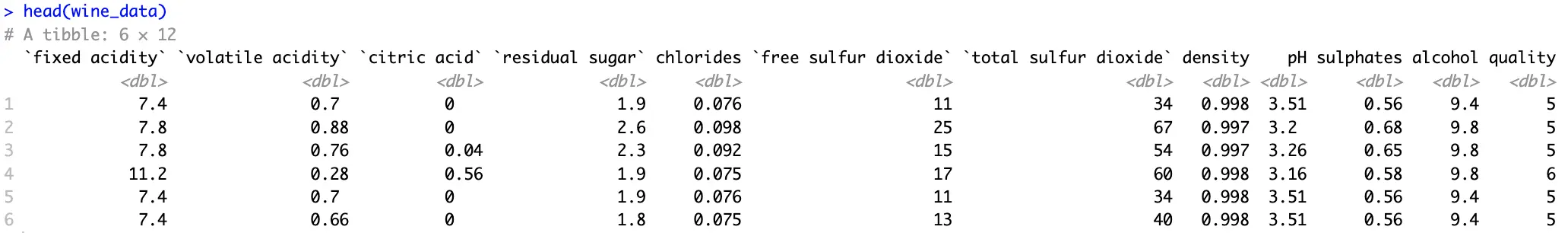
Another issue is the distribution of the target variable:
wine_data %>%
  group_by(quality) %>%
  count()
Image 2 – Target variable distribution
Two major issues:
Variable type – We’ll build a classification dataset, and it needs a factor variable. Conversion is fairly straightforward.
Too many distinct values – That is, if you consider how few data points are available for the least represented classes.
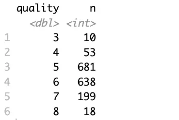
To mitigate, you’ll want to group the data further, let’s say into three categories (bad, good, and great), and convert this new attribute into a factor:
Better, but the data still suffers from a class imbalance problem.
Since it’s not the focal point of today’s article, let’s consider this dataset adequate and shift the focus to machine learning.
R tidymodels in Action – Model Training, Recipes, and Workflows
This section will walk you through the entire machine learning pipeline, without evaluation. That’s what the following section is for.
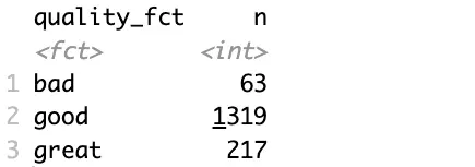
Train/Test Split
The tidymodels ecosystem uses the `rsample` package to perform a train/test split. To be more precise, the `initial_split()` function is what you’re looking for.
It allows you to specify the portion of the data that’ll belong to the training set, but more importantly, it allows you to control stratification. In plain English, you want to use stratified sampling when classes in your target variable aren’t balanced. This way, the split will preserve the proportion of each class in the resulting training and testing set:
Image 4 – Number of records in training/testing sets
These subsets will be used for training and evaluation later on.
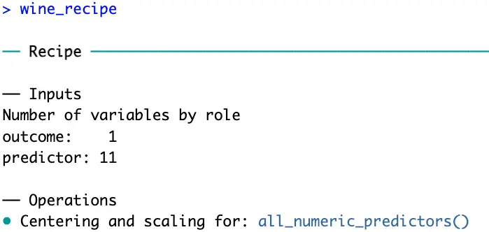
R tidymodels Recipes
The `recipes` package is part of the tidymodels framework. It provides a modern and consistent approach to data preprocessing, which is an essential step before predictive modeling.
There are dozens of functions you can choose from, and the one(s) you go with will depend on your data. Our wine quality dataset is clean, free of missing values, and contains only numerical features. The only problem is the scale.
That’s where `step_normalize()` function comes in. Its task is to normalize numeric data to have a mean of 0 and a standard deviation of 1.
But before normalizing numerical features, you have to specify how the data will be modeled with a model equation. The left part contains the target variable, and the right part contains the features (the dot indicates you want to use all features). You also have to provide a dataset, but just for fetching info on column names and types, not for training:
R recipes now knows you have 11 predictor variables which should be scaled before proceeding.
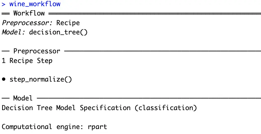
Workflows and Model Definition
Workflows in R tidymodels are used to bundle together preprocessing steps and modeling steps. So, before declaring a workflow, you’ll have to declare the model.
A decision tree sounds like a good option since you’re dealing with a multi-class classification dataset. Just remember to set the model in classification mode:
That’s everything you need to train a machine learning model. The tidymodel package knows you want to create a decision tree classifier, and also knows how the data should be processed before training.
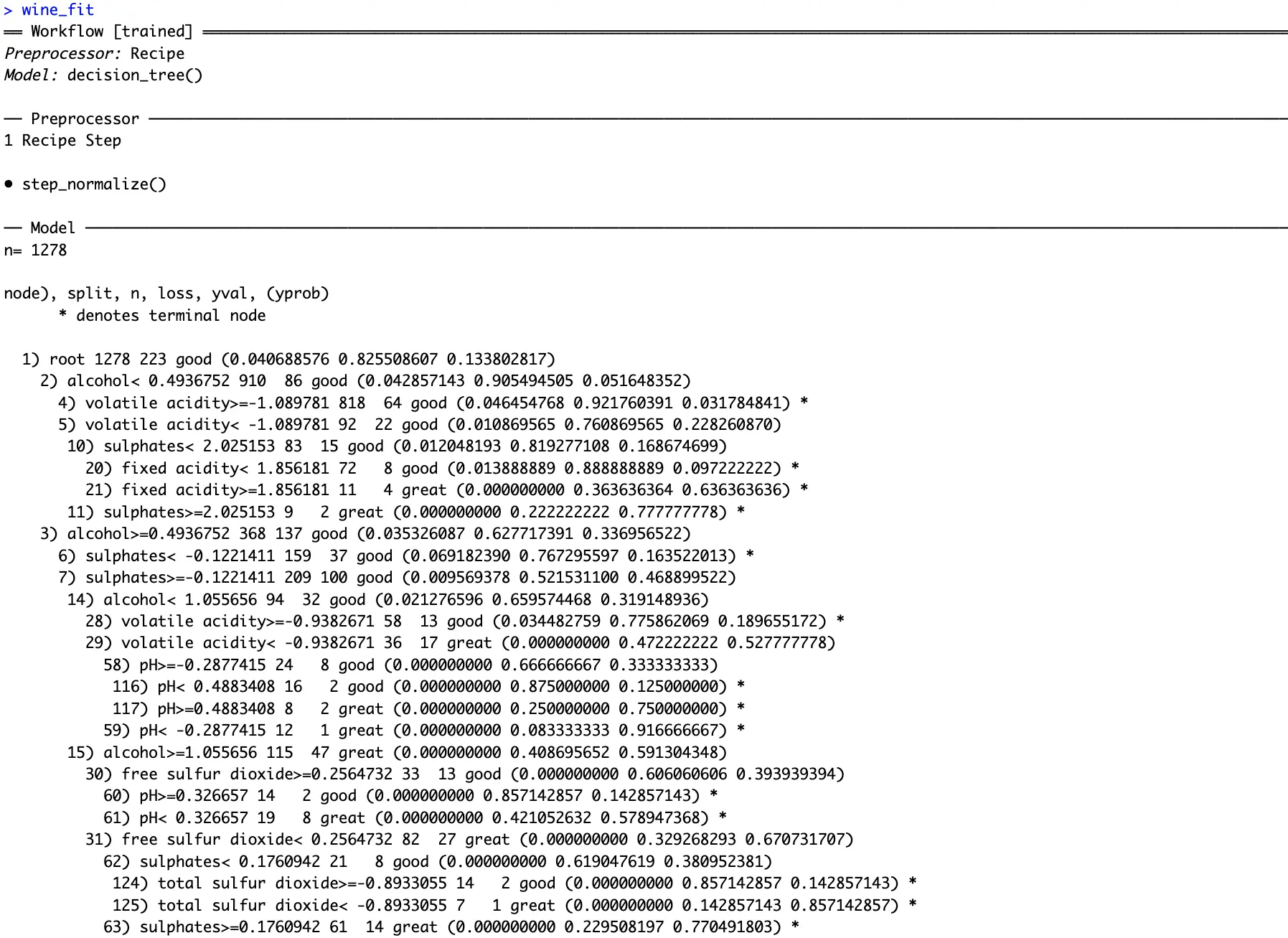
Model Fitting
The only thing left to do is to chain a `fit()` function to the workflow. Remember to fit the model only on the training dataset:
You can see how the fitted decision tree classifier decided to shape the decision pathways. Conditions might be tough to spot from text, so in the next section, we’ll dive deep into visualization.
R tidymodels Model Evaluation – From Numbers to Charts
This section will show how good your model is. You’ll first see how the model makes decisions and which features it considers to be most important. Then, we’ll dive into different classification metrics.
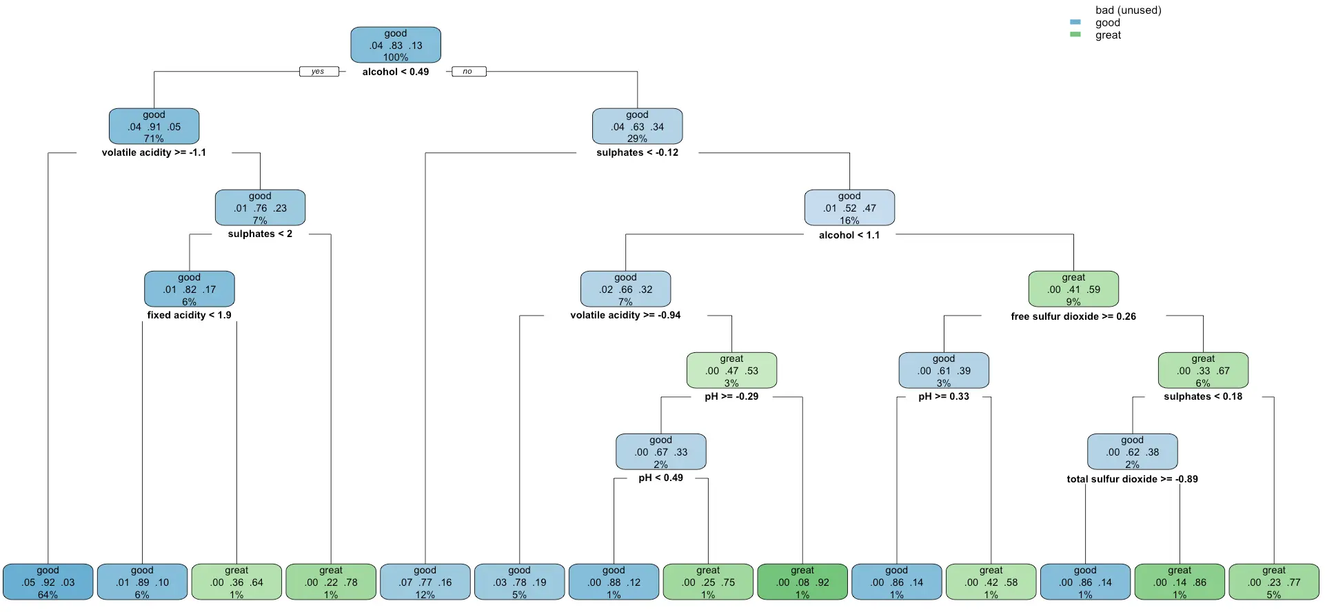
Model Visualization
Remember the decision tree displayed as text from the previous section?
It takes two lines of code to represent it as a chart instead of text. By doing this, you’ll get deeper insights into the inner workings of your model. Also, if you’re a domain expert, you’ll have an easier time seeing if the model makes decisions in a similar way you would:
It looks like the model completely disregards the `bad` category of wines, probability because it was the most unrepresented one. It’s something worth looking into if you have the time.
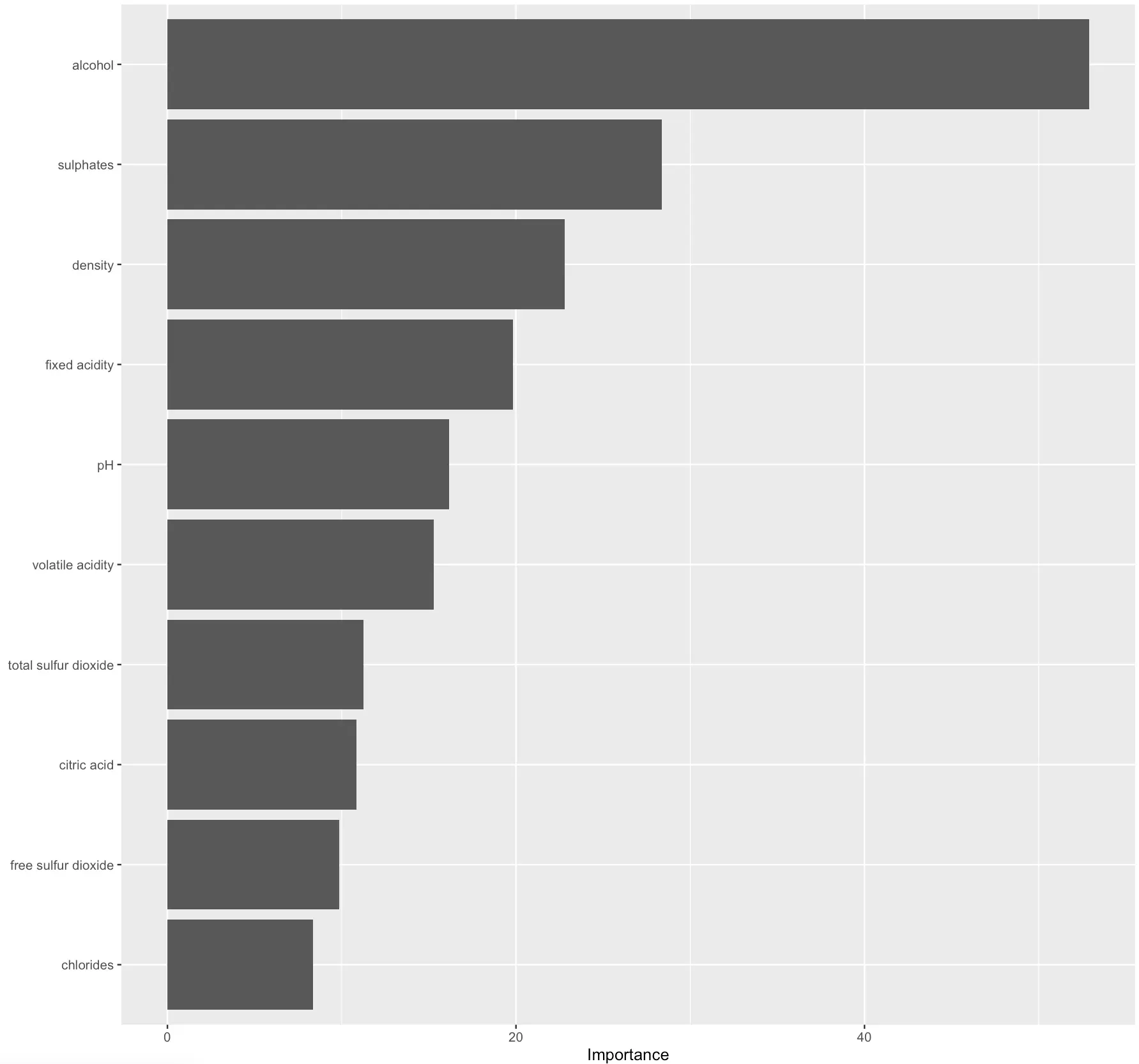
Similarly, you can extract and plot feature importances of a decision tree classifier:
wine_fit %>%
  extract_fit_parsnip() %>%
  vip()
Image 9 – Feature importance plot
The higher the value, the more predictive power the feature carries.
In practice, you could disregard the least significant ones to get a simpler model. Out of the scope for today, but I would be interesting to see what impact would this have on prediction quality.
Prediction Evaluation
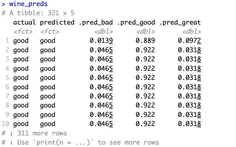
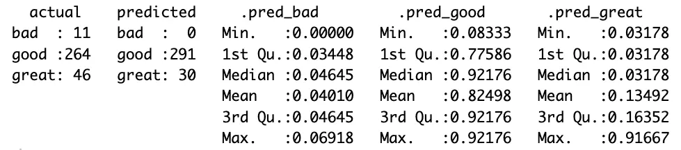
Speaking of prediction quality, the best way to understand it is by calculating predictions on the test set (previously unseen data) and evaluating it against true values.
The following code snippet will get the predicted classes and prediction probabilities per class for you. It will also rename a couple of columns, so they’re easier to interpret:
Actual and predicted classes all match in the above image and probabilities are high where they should be.
It looks like the model does a good job. But does it? Evaluation metrics for the classification dataset will answer that question. We won’t explain what each of them does, as we have an in-depth article on the subject.
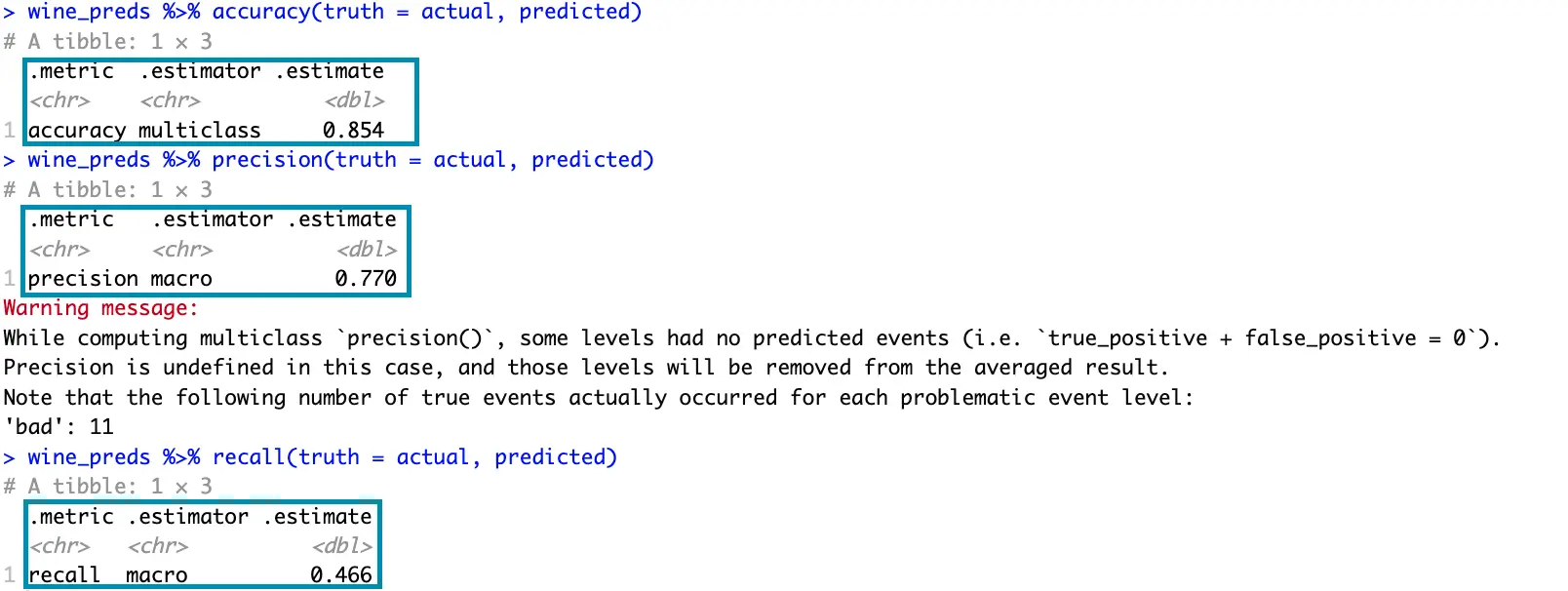
The following snippet prints the values for accuracy, precision, and recall:
The model misclassified 11 bad wines as good, which is potentially a concerning factor. Further data analysis would be required to drive any meaningful conclusions.
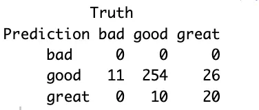
If you find the confusion matrix to be vague, then the model summary will show many more statistics per target variable class:
wine_preds %>%
  summary()
Image 13 – Model summary
You now get a more detailed overview of the values in the confusion matrix, along with various statistical summaries for each class.
R tidymodels (yardstick in particular) come with a couple of visualizations you can show to get a better understanding of your model’s performance.
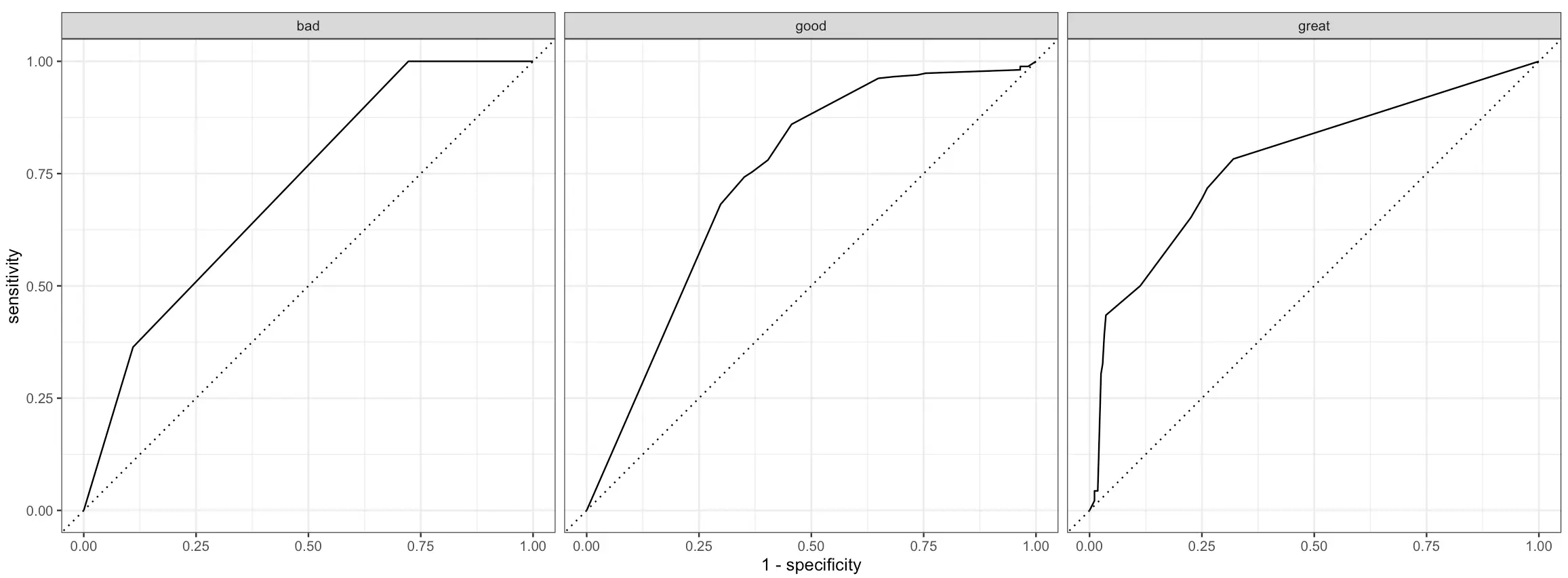
One of these is an ROC (Reciever Operating Characteristics) curve. In short:
It plots the true positive rate on the x-axis and the false positive rate on the y-axis
Each point on the graph corresponds to a different classification threshold
The dotted diagonal line represents a random classifier
The curve should rise from this diagonal line, indicating that predictive modeling makes sense
The area under this curve measures the overall performance of the classifier
ROC curve has to be plotted for each class of the target variable individually, and doing so is quite straightforward with tidymodels:
Better than random, but leaves a lot to be desired.
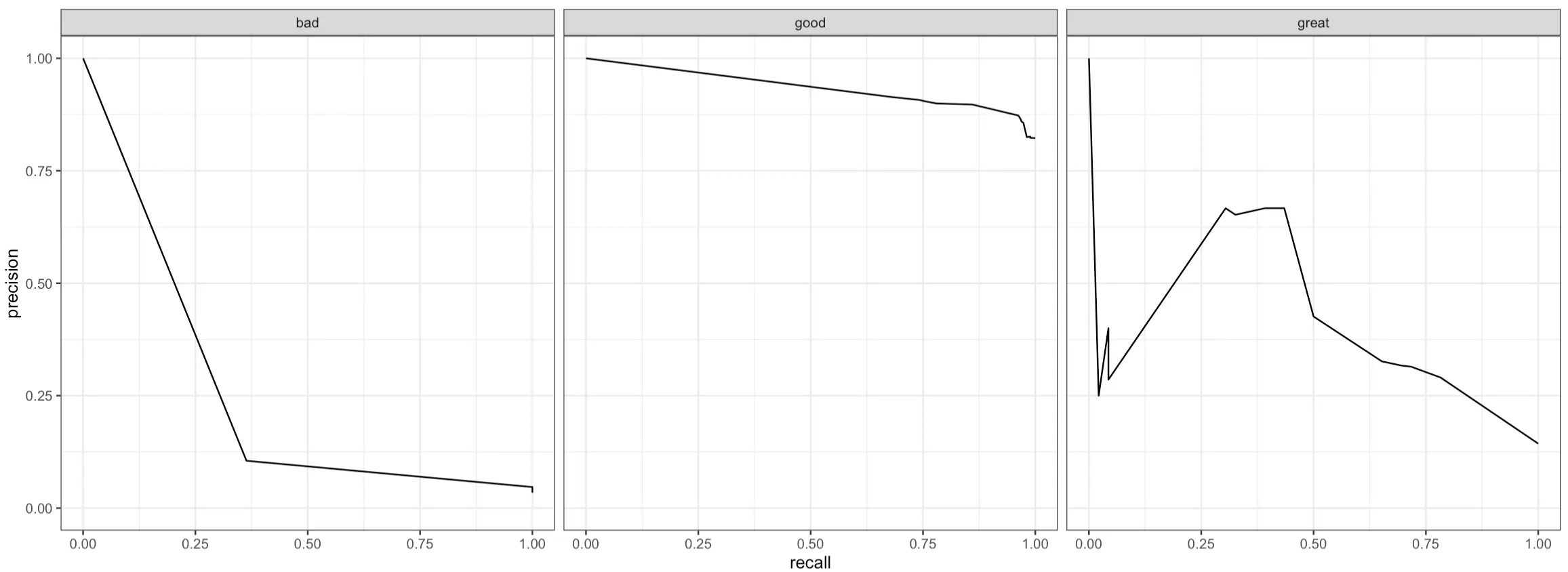
Another curve you can plot is the PR (Precision-Recall) curve. In short:
It plots precision (y-axis) against recall (x-axis) for different classification thresholds to show you the trade-offs between these two metrics
A curve that’s close to the top-right corner indicates the model performs well (high precision and recall)
A curve that’s L-shaped suggests that a model has a good balance of precision and recall for a subset of thresholds, but performs poorly outside this range
A flat curve represents a model that’s not sensitive to different threshold values, as precision and recall values are consistent
Just like with ROC curves, PR curves work only on binary classification problems, meaning you’ll have to plot them for every class in the target variable:
Image 15 – Per class precision-recall (PR) curve plot
And that’s all we want to show for today. There are more evaluation metrics available, but these are the essential ones you’ll use in all classification projects.
Summing Up R tidymodels
To conclude, R tidymodels provides a whole suite of packages that work in unison.
The entire pipeline achieves the same results as the one that uses a traditional set of R’s functions, but you can’t negate the benefit of improved code flow, increased readability, and similarity with other packages you’re using daily. That is, if you’ve worked with tidyverse before. And you probably did.
Building and evaluating machine learning models with tidymodels is a pleasant developer experience, and we’ve only scratched the surface. There are many more models to explore, evaluation metrics to use, and data processing functions to call. We’ll leave that up to you.
What are your thoughts on R tidymodels? Has this suite of packages replaced R’s default functions for machine learning?Join our Slack community and let us know.
Long-Term Implications and Future Developments of R tidymodels
For data science practitioners who utilize R for their machine learning (ML) tasks, a key game-changer is the introduction and evolution of R tidymodels. As a collection of packages offering a one-stop-shop for all ML-related tasks, from data processing to training and evaluation of models, R tidymodels scales and simplifies the machine learning pipeline in R.
Implications
At the heart of many future developments in data science, R tidymodels signals a significant shift in R programming and machine learning. As the ecosystem expands, this approach to machine learning holds the potential to become the standard in the R community, offering many benefits:
Simplified Coding Flow: R tidymodels offers an improved code flow, increasing readability and making it easy for developers to implement advanced machine learning techniques.
Interoperability: The tidymodels pipeline integrates seamlessly with R’s tidyverse package, a popular collection of easy-to-use libraries designed for data science.
Increased Efficiency: As a framework focused on providing a unified modeling interface, tidymodels eliminates the need to move between different syntaxes and workflows associated with different machine learning models.
Future Developments
As R tidymodels continues to evolve and refine, developers can expect:
Expanded Model Support: The future will likely see the support of more diverse and complex models within the tidymodels ecosystem.
Enriched Libraries: New data processing functions, visual representations, and evaluation metrics are anticipated to be included in future versions of tidymodels.
Improved User Experience: With further development and fine-tuning, users can expect an even more intuitive and streamlined user experience.
Actionable Advice: Leveraging R tidymodels for Machine Learning
Based on the insights derived from the text, those looking to utilize R tidymodels effectively can consider the following recommendations:
Emphasize Data Preprocessing: Make extensive use of the `recipe` package within tidymodels, availing its modern and consistent approach to preprocessing.
Utilize Workflows: Exploit the power of workflows in tidymodels to bundle together preprocessing steps and modeling steps hence improving organization and readability.
Familiarize with Evaluation Metrics: Use the `yardstick` package to implement evaluation metrics and have a robust understanding of your model’s performance.
Handle Class Imbalance: Pay attention to class imbalance in your datasets. Use stratified sampling to preserve the proportion of each class.
Explore and Use Visualization: Use built-in visualizations to better understand your model performance and reveal relationships within your data.
In conclusion, the shift to R tidymodels illustrates a key progression within the R programming community, towards efficient, readable, and expandable machine learning applications. Existing and new R users are encouraged to explore and adopt tidymodels for their machine learning needs.
Want to share your content on R-bloggers? click here if you have a blog, or here if you don’t.
Shiny applications are fantastic for turning data into interactive dashboards and web apps, making data exploration and visualization more engaging. But even the most visually appealing Shiny app can hit performance snags. Lagging visualizations, delayed user interactions, and sluggish data updates can quickly turn a promising Shiny app into a frustrating user experience.
That’s where profiling comes in. Profiling helps you figure out which parts of your code are slowing things down. By identifying these bottlenecks, you can make the right tweaks to speed up your app and make it more enjoyable to use.
In this guide, we’ll explore the key tools and techniques for profiling R and Shiny code. You’ll learn how to turn the data from these tools into practical steps to improve performance. This is just the beginning—stay tuned for more tips and real-world examples to help you optimize your Shiny apps even further.
Why Do We Even Need Profiling?
Even the most dazzling Shiny app can become frustratingly slow if you don’t profile your code. Below are the key reasons why profiling is an essential step in the development process:
Unmasking Hidden Bottlenecks: Shiny apps can appear functional on the surface, but sluggish performance can lurk beneath. Profiling exposes these hidden bottlenecks, allowing you to pinpoint the root causes of slowdowns.
Optimization for a Smooth User Experience: An application performance is a fundamental determinant of a positive user experience (UX). Profiling empowers you to identify performance issues hindering responsiveness and create a seamless user experience.
Avoiding Premature Optimization: Profiling data guides your optimization efforts. You can focus on fixing areas that truly matter, rather than wasting time on unnecessary code changes, that don’t bring much value
Ensuring Scalability as Your App Grows: As your Shiny app attracts more users and handles larger datasets, performance becomes even more critical. Profiling helps you build a foundation for a scalable and future-proof application.
It is a valuable tool that acts as a magnifying glass, allowing you to peer into the inner workings of your code. By visualizing how different parts of your app execute, profvis helps you identify areas that might be slowing things down. It provides an interactive flame graph that visualizes the app’s call stack in time and highlights the corresponding lines of code on click.
Dives deep into reactive expressions and observer events to pinpoint inefficiencies. reactlog acts like a conversation monitor for your app, revealing how different parts of your code interact and react to user input. By analyzing these conversations, reactlog helps you identify areas where your app might be reevaluating things unnecessarily, potentially slowing down performance. This package also provides a visual representation of the reactive dependency graph. This visualization can be invaluable in understanding the complex interactions and dependencies within your app, further aiding in the identification and resolution of performance issues.
Sometimes difficult questions have simple answers. This package is a straightforward and effective tool for timing sections of your Shiny code. Just add 1 line of code and you’re done. It gives you a good starting point to initiate your profiling journey.
Modern browsers come equipped with powerful developer tools that allow you to profile JavaScript execution and DOM manipulation. You can find them in the browser’s DevTools, inside tabs like Performance, Network, Memory, Lighthouse. These tools can reveal inefficiencies in your Shiny app’s JavaScript code that might not be apparent from server-side profiling alone. You can analyze the network activity to identify potential issues with data transfer between the server and client. This can be particularly useful for Shiny apps that handle large amounts of data or rely on real-time updates.
Interpreting the Profiling Battleground: Deciphering the Data
The profiling tools we explored have equipped you with a war chest of data. However, to truly overcome performance bottlenecks, you need to be able to decipher the data these tools provide. Here’s your guide to navigating the profiling battleground:
Understanding the Metrics:
Wall Clock Time: This metric reveals the total elapsed time during code execution. Look for functions or code blocks with disproportionately high wall clock times to identify potential bottlenecks.
CPU Usage: High CPU usage indicates code that is demanding on your server’s processing power. Target these areas for optimization, especially if you anticipate high user concurrency.
Memory Allocation: Spikes in memory allocation can signal memory-intensive operations that could lead to slowdowns or crashes. Be particularly vigilant when dealing with large datasets.
Evaluation Count: This metric, from reactlog, shows how many times a reactive expression is reevaluated. Excessive evaluations can significantly impact performance. Aim to minimize unnecessary reevaluations.
Evaluation Time: This metric, from reactlog, reveals the time taken for each reactive expression evaluation. Focus on expressions with high evaluation times to identify areas for optimization.
Flame Graph: This is not just a metric but a complete interactive visualization provided by profvis of your shiny app with a horizontal timeline which helps you evaluate your app timings.
Identifying the Enemies:
By analyzing the profiling data, you can pinpoint the enemies hindering your Shiny app’s performance:
Time Hogs: These are code sections that consume excessive wall clock time. They might be computationally expensive functions, inefficient loops, or overly complex calculations.
Memory Guzzlers: Operations that lead to significant spikes in memory allocation are your memory guzzlers. These could be functions that create large temporary data structures or handle massive datasets inefficiently.
Chatty Reactives: Reactive expressions that are reevaluated frequently, especially if the reevaluations are unnecessary, are your chatty reactives. They can lead to sluggish updates and unresponsive UIs.
Correlating the Data:
Don’t analyze the data from each tool in isolation. Look for correlations between the metrics to gain a more comprehensive understanding of the bottlenecks. For example, a function with high wall clock time in Rprof might also show high CPU usage, indicating a computationally expensive operation. Similarly, a chatty reactive expression in reactlog might have a corresponding high evaluation time, further highlighting the need for optimization.
Embrace Visualization:
The visual representations from profvis can be invaluable in identifying bottlenecks. Flame graphs allow you to quickly see which functions are taking the most time and how they are nested within each other. This visual perspective can often reveal inefficiencies that might be missed by simply poring over raw data.
By mastering the art of interpreting profiling data, you can transform cryptic metrics into actionable insights. These insights will be the foundation for the optimization strategies we’ll explore in the next section.
Wrapping Up A Guide to Profiling R and R Shiny Code
Profiling is key to building fast, efficient Shiny applications. It helps you identify and fix the parts of your code that are slowing things down. Tools like Rprof, profvis, reactlog, and shiny.tictoc can pinpoint these bottlenecks, turning complex data into clear steps for improvement. This ensures your Shiny apps are not only visually appealing but also responsive and scalable.
This guide is just the start. Stay tuned for more posts where we’ll dive into advanced optimization techniques, and offer tips for building top-notch Shiny applications. Keep profiling, keep optimizing, and let’s make your Shiny apps as powerful and smooth as they can be.
Profiling R and Shiny Code: A Long-Term Approach to Enhance Application Performance
Profiling: An Integral Part of Development
Profiling is a crucial process in the development of R and Shiny applications. It assists in identifying hidden bottlenecks that can slow down the app, making it fundamental to ensuring a smooth and enjoyable user experience. Profiling data guides optimization efforts, helping avoid unnecessary and unproductive code changes. Moreover, as a Shiny app attracts more users and deals with larger datasets, the importance of profiling increases, ensuring scalability and the application’s future-proof characteristics.
Profiling Tools and Their Implications
Several profiling tools like Rprof, profvis, reactlog, and shiny.tictoc are useful. These tools not only help in identifying the slowing-down components of the code but translate complex performance data into practical steps for application improvement. Alongside the already existing server-side profiling tools, modern browsers also offer robust client-side tools for profiling JavaScript execution and DOM manipulation, revealing potential inefficiencies in Shiny apps that might not be apparent from server-side profiling.
Long-term Implications and Future Developments
In the long run, frequent profiling and the use of these tools can lead to significant improvements in both the performance and user experience of a Shiny app. With increasing reliance on data and user interactivity in today’s web applications, focusing on profiling can lead to creating more efficient and advanced apps, thereby enhancing productivity and end-user satisfaction.
The advent of new and more efficient profiling tools can be expected in the future. These can further simplify performance optimization, saving developers’ time and making applications faster and easier to use. Advanced optimization techniques on profiling data can be employed to take app performance to the next level.
Actionable Advice
Integrate Profiling in the Development Process: Don’t treat profiling as an afterthought. Instead, make it an integral part of your development process to ensure your apps are fast, efficient, and responsive.
Leverage Multiple Profiling Tools: No single tool can provide all insights into your code performance. Use a combination of several available tools to get a comprehensive view of your app’s performance.
Focus on Interpretation: Profiling data in itself might not be immediately helpful. Learn to interpret this data to gain actionable insights. Correlating data from various tools can provide a comprehensive understanding of the bottlenecks.
Stay Up-to-Date: With technologic advancements, new profiling tools and techniques can surface. Stay updated with the latest developments to leverage the best and the most suitable tools for your applications.
With consistent profiling, maintaining a balance between visual appeal and speedy performance in a Shiny App becomes achievable, resulting in more optimized and user-friendly applications.
arXiv:2407.12899v1 Announce Type: new Abstract: Story visualization aims to create visually compelling images or videos corresponding to textual narratives. Despite recent advances in diffusion models yielding promising results, existing methods still struggle to create a coherent sequence of subject-consistent frames based solely on a story. To this end, we propose DreamStory, an automatic open-domain story visualization framework by leveraging the LLMs and a novel multi-subject consistent diffusion model. DreamStory consists of (1) an LLM acting as a story director and (2) an innovative Multi-Subject consistent Diffusion model (MSD) for generating consistent multi-subject across the images. First, DreamStory employs the LLM to generate descriptive prompts for subjects and scenes aligned with the story, annotating each scene’s subjects for subsequent subject-consistent generation. Second, DreamStory utilizes these detailed subject descriptions to create portraits of the subjects, with these portraits and their corresponding textual information serving as multimodal anchors (guidance). Finally, the MSD uses these multimodal anchors to generate story scenes with consistent multi-subject. Specifically, the MSD includes Masked Mutual Self-Attention (MMSA) and Masked Mutual Cross-Attention (MMCA) modules. MMSA and MMCA modules ensure appearance and semantic consistency with reference images and text, respectively. Both modules employ masking mechanisms to prevent subject blending. To validate our approach and promote progress in story visualization, we established a benchmark, DS-500, which can assess the overall performance of the story visualization framework, subject-identification accuracy, and the consistency of the generation model. Extensive experiments validate the effectiveness of DreamStory in both subjective and objective evaluations. Please visit our project homepage at https://dream-xyz.github.io/dreamstory.
The article “DreamStory: An Automatic Open-Domain Story Visualization Framework” introduces a novel framework called DreamStory that aims to create visually compelling images or videos based on textual narratives. While existing methods have made progress, they still struggle to generate a coherent sequence of subject-consistent frames solely from a story. DreamStory addresses this challenge by leveraging Language and Vision models (LLMs) and a Multi-Subject consistent Diffusion model (MSD). The framework consists of an LLM that acts as a story director and an MSD that generates consistent multi-subjects across the images. DreamStory uses the LLM to generate descriptive prompts for subjects and scenes, annotating each scene’s subjects for subsequent subject-consistent generation. It then utilizes these detailed subject descriptions to create portraits of the subjects, which serve as multimodal anchors. The MSD employs Masked Mutual Self-Attention and Masked Mutual Cross-Attention modules to ensure appearance and semantic consistency with reference images and text. Experiments validate the effectiveness of DreamStory, and a benchmark, DS-500, is established to assess the overall performance of the framework.
Exploring DreamStory: A New Approach to Story Visualization
The field of story visualization has made significant progress in recent years, with researchers striving to create visually striking images and videos that accurately represent textual narratives. While diffusion models have shown promise, existing methods still struggle to seamlessly create a coherent sequence of subject-consistent frames based solely on a story. In response to this challenge, DreamStory offers an innovative solution, introducing an automatic open-domain story visualization framework that leverages Language and Vision Models (LLMs) along with a novel multi-subject consistent diffusion model.
The Components of DreamStory
DreamStory comprises two key components:
LLM as the Story Director: The LLM plays a crucial role in DreamStory by generating descriptive prompts aligned with the story. These prompts help create subjects and scenes that are coherent with the narrative, ensuring subject-consistent generation in subsequent stages.
Multi-Subject Consistent Diffusion Model (MSD): The MSD, an innovative addition to DreamStory, utilizes detailed subject descriptions provided by the LLM to generate portraits of the subjects. These portraits, along with corresponding textual information, serve as multimodal anchors or guidance. The MSD uses these anchors to generate story scenes with consistent multi-subject representation.
Incorporating this multi-subject consistency is crucial in story visualization, as it enhances the overall coherence and immersion experienced by the viewer. Without subject consistency, the visual representation may become disjointed or confusing, hindering the storytelling aspect of the visualization.
Making Use of Masked Mutual Self-Attention and Cross-Attention
The MSD component of DreamStory incorporates Masked Mutual Self-Attention (MMSA) and Masked Mutual Cross-Attention (MMCA) modules to ensure appearance and semantic consistency in the generated visuals.
The MMSA module helps maintain appearance consistency by leveraging reference images. This module ensures that the generated visuals resemble the reference images in terms of appearance, preventing any abrupt changes or discrepancies. Consequently, the generated frames smoothly transition while maintaining visual cohesiveness.
The MMCA module, on the other hand, focuses on semantic consistency with reference texts. By incorporating the textual information provided alongside the subject portraits, DreamStory ensures that the generated visuals adhere to the intended semantic context. This module ensures that the visuals accurately represent the textual descriptions, enriching the viewer’s understanding of the story.
Both modules employ masking mechanisms that prevent subject blending. This approach ensures that each subject retains its distinct characteristics and does not overlap with other subjects, achieving a visually pleasing and coherent composition.
Evaluating DreamStory’s Performance
In order to validate DreamStory’s effectiveness and encourage further advancements in story visualization, a benchmark called DS-500 has been established. This benchmark assesses DreamStory’s overall performance, subject-identification accuracy, and the consistency of the generation model.
Extensive experiments have been conducted to evaluate DreamStory using both subjective and objective measures. The results have demonstrated the efficacy of DreamStory in creating visually engaging and subject-consistent story visualizations. These findings contribute to the ongoing progress in the field and pave the way for future innovations in story visualization techniques.
If you are interested in learning more about DreamStory and exploring its capabilities, please visit our project homepage at https://dream-xyz.github.io/dreamstory.
The paper titled “DreamStory: An Automatic Open-Domain Story Visualization Framework” introduces a novel approach to story visualization using language models and a multi-subject consistent diffusion model. Story visualization involves generating visually appealing images or videos that correspond to textual narratives. While there have been advancements in diffusion models for this task, existing methods struggle to create a coherent sequence of subject-consistent frames solely based on a story.
The proposed framework, DreamStory, consists of two main components: an LLM (Language and Logic Model) acting as a story director and a Multi-Subject consistent Diffusion model (MSD) for generating consistent multi-subject across images. The LLM is responsible for generating descriptive prompts for subjects and scenes aligned with the story. It annotates each scene’s subjects, enabling subsequent subject-consistent generation. This step helps establish a strong foundation for the visual representation of the story.
DreamStory leverages detailed subject descriptions generated by the LLM to create portraits of the subjects. These portraits, along with their corresponding textual information, serve as multimodal anchors or guidance for the generation process. The MSD utilizes these multimodal anchors to generate story scenes with consistent multi-subject. The MSD includes Masked Mutual Self-Attention (MMSA) and Masked Mutual Cross-Attention (MMCA) modules to ensure appearance and semantic consistency with reference images and text, respectively. The masking mechanisms employed by these modules prevent subject blending, resulting in more coherent and visually consistent story visualizations.
To evaluate the proposed approach and facilitate further research in story visualization, the authors have introduced a benchmark called DS-500. This benchmark assesses the overall performance of the story visualization framework, subject-identification accuracy, and the consistency of the generation model. The authors have conducted extensive experiments to validate the effectiveness of DreamStory, using both subjective and objective evaluations.
Overall, this paper presents a promising approach to open-domain story visualization by combining language models and a multi-subject consistent diffusion model. The use of multimodal anchors and the incorporation of masking mechanisms in the MSD contribute to generating visually coherent and subject-consistent story scenes. The establishment of a benchmark for evaluation purposes is a valuable contribution to the field, enabling researchers to compare and improve upon existing methods. This work opens up possibilities for further advancements in story visualization and has the potential to enhance various applications such as movie production, video game design, and virtual reality experiences. Read the original article